The Specter of “What About Turnout” Haunts The Literature
About that new Bonica et al paper on electoral penalties and moderation

Adam Bonica and coauthors recently published a paper called “The Electoral Consequences of Ideological Persuasion: Evidence from a Within-Precinct Analysis of U.S. Elections” that has been getting a TON of play Online (tm) and was cited in a classic Edsall “here are a bunch of emails I received” NYT article. Behind that kind of milquetoast title is a very interesting paper looking at the effect of contest midpoint ideology [much more on this in a moment] on vote choice using variation in vote share between candidates on the same ballot. It finds small effects, which tracks with the literature, and which I would probably attribute mostly to an absence of ticket splitting and lack of information about down-ballot races, but either way. They also control for existing partisan lean of the precinct, which helps get away from the “Dems in very Dem places do well” problem. They don’t see evidence of dropoff within ballots being affected by relative ideology between races, which also scans. This is all a useful addition to the research.
However, the way it was presented on bluesky was like this:

Which, obviously, immediately injected it into the Discourse Mines.
This is pretty annoying because those two graphs are generally unrelated to the core of their paper (and do not use their clever study design at all), and also bait. I would normally feel pretty bad picking on a paper for one tossed-off section that felt weak, but given that the authors are explicitly spotlighting this section in news coverage and online, here we are.
I’m going to break this into two chunks. Chunk 1, turnout analysis, and Chunk 2, ideology measure problems.
Turnout Analysis (or Lack Thereof)
The first graph (“Closing the Partisan Turnout Gap”) says that Democratic vote share rises when a greater percentage of registered Democrats vote, as compared to the percentage of registered Republicans who vote.

Which...okay?
This is technically a step away from “Democrats get more votes when more Democrats vote”, but still, I don’t see how this could *avoid* being true. The counterfactual would be some election where less registered Democrats showed up but simultaneously a lot of Republicans showed up and voted for a Democrat. Some kind of only-Republican-mobilization that turns off Democrats but is hyper persuasive to Republicans? This is generally Not A Thing. I know people like to pretend that this is a Democratic strategy, but no Democrat ever has gone “actually, I DON’T want Democrats to vote for me, only Republicans”. No, it doesn’t count if they say they don’t want the far left to vote for them, that isn’t all Democrats and is usually in the context of a tradeoff for more moderate voters.
Frankly I think framing this graph as the “partisan turnout gap” is kind of misleading. This specific metric would penalize Democrats for expanding the pool of registered voters.
As will become a pattern, my problem is less with the graph and more with the framing. The authors have presented this as a graph showing that Democrats should focus on turnout, and specifically that the electoral (persuasion) benefits of moderation are outweighed by the turnout losses. *They do not present evidence for this.* The graph presented doesn’t show the magnitude of turnout penalties to moderate candidates. It doesn’t show the tradeoff they claim is present.
I wanted to see the turnout ratio compared to ideological midpoint to see if there was a trend there, although since I couldn’t find the data in anything but the graph I had to do some awkward transcribing. Thus, caveat that the numbers here are 100% from me squinting at the original graphs and guessing. They’re probably pretty close.

“Graph of numbers eyeballed off another graph” is not the best analysis in the world [and if someone else has the actual numbers here, lmk and I will recreate this], but if I had to guess, there’s no trend here. It doesn’t look like changing ideological midpoint is doing anything to turnout ratio. As they say in the paper itself: “A candidate’s ability to shift overall turnout is limited compared to their ability to adjust ideological positioning”.
In a paper that is explicitly about holding turnout constant to look at the penalties to vote share from extremism, because of how confounded turnout is, it’s strange to have your public-facing take away be about a turnout analysis you mostly didn’t do. I don’t think it does the paper itself any service, and again, I feel weird picking on what is essentially two very hyped up graphs, but if you cite them in the NYT and put them online, I’m going to.
Ideology Measurement Problems
I think the above turnout problem handles 90% of what I’ve seen about this paper. The rest hinges on comparing their ideology measure to performance. People have gotten into it on twitter about if DIME is a reliable measure, and there’s been some muddying of the water. The researchers use a composite measure in the actual paper, but have occasionally tweeted graphs made with just DIME (or labeled as such? It’s a little unclear to me). While I have some questions about the effectiveness of DIME for comparing ideology across time, I think the composite thing Bonica et all are doing here is basically fine.
The issue I have is that “ideology” as presented in the paper, and in their twitter-famous graphs, is not actually comparable to the DW-NOMINATE style measure of individual elected ideology. The ideology measure here is the “average ideological midpoint between opposing Democratic and Republican candidates in House contests”. This is a sort of “average ideology of the whole contest” thing. The logic seems to be that since, in their within-precinct design, voters are comparing between entire races rather than individual candidates, this metric would be more accurate. That might be true? I find that it makes it very difficult to interpret their results. The penalties they report for shifts in ideology are penalties to Democratic vote share for the midpoint ideology of the entire race moving to the right, which is not the same thing as *the Democratic candidate* moving to the right.
[this ideological midpoint measurement is notably different than the metric used in other papers, even when trying to account for D and R ideology at the same time. See Bailey and Reese “Ideological Moderation and Success in U.S. Elections, 2020-2022” for an example I think is clever]
The midpoints are constructed like so (borrowing a graph from later in the paper where they talk more about polarization):

This very explicitly not just a measure of the ideology of one candidate, it’s a measure of the combined ideology of both candidates in the race. That metric is interesting when your unit of analysis is entire contests together on a ballot and you’re looking at how relative ideology affects voteshare (although still, imo, confusing). When you’re making claims about how a specific party or candidate should act, it doesn’t make a lot of sense.
The second graph they featured on twitter uses an average of those ideological midpoints across all US House races by year. That is, they take the average ideology between the D and the R in each race from their composite measure, and then take an average of *that* average across all house races.
Personally, I would not call that “Party Positioning” since it is not the result of solely positioning by either party. It is also not clear that this is the result of positioning choices by the Democratic party primarily or at all, and the conclusion in the subhed that “Democrats do better running to the left” isn’t supported by this graph.

As an example, here’s some made up data for a handful of districts where the Republican candidates adjust their ideology to the right, the Democrats don’t move, and the average midpoint metric consequently moves right. If you presented this as “Democrats moving right” you would be strictly wrong. If there was an electoral penalty to Democrats in these races, it’s not immediately clear how to interpret it.
Treating these results as results of behaviors *by Democrats* only really works if you assume Republicans have no agency and are not making ideological moves all the time.
The Tinicum, PA example they provide shows this nicely:
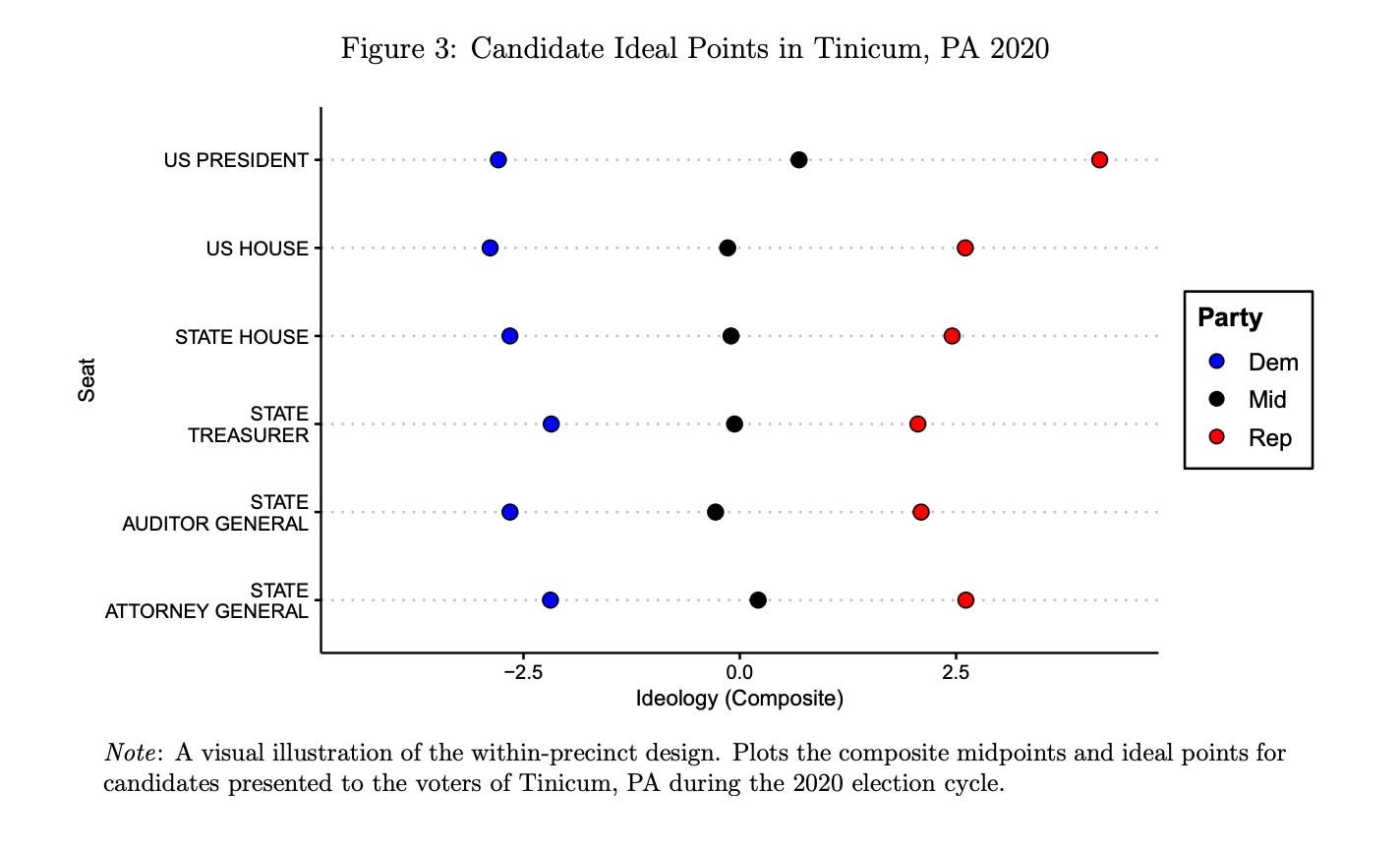
Here, you can see that the Democrats were roughly in line with each other, with the state Treasurer a little more right (Joe Torsella, who I had never heard of and don’t have an opinion on) along with the state AG. The Republicans, on the other hand, had a much more right-leaning Presidential candidate (2020-era Trump).

Once you take the midpoints, you can start making claims like “the Presidential midpoint was more right than that of the other races”, which is true, but tells you exactly nothing about the Democratic presidential candidate. This is fueling a lot of the bad takes deriving from this paper.
Twitter vs Paper
I am in general very interested in political science literature and how it can be applied to the practice of politics. This means I am absolutely one of those weirdos on twitter who are hype about new papers on electoral effects from whatever, and that I notice when these types of papers come around. I am sympathetic to the pressures people face to make their results conform with the current Discourse (tm) and get those sweet media placements.
The story of this specific paper has been a wild divergence between the actual results in the body of the paper (small effects, reasonable, measured) and the abstract and discussion on twitter (dramatic, clear strategy impacts for Democrats, ideological bent). While I think this is an interesting contribution to thinking about Democratic strategy, it absolutely does not support the “moderation isn’t worth it” conclusion it’s being marketed as.
The paper itself is pretty clear on the fact that it is in line with existing literature showing a small but meaningful penalty to extremism. They provide a helpful chart of existing literature, which I very much appreciate. (It is also a bit funny that the academics here call 3 points a “small penalty”, when I consider that quite large)

(sorry for the small screenshot)
There is so much space to argue about the electoral effects of moderation within existing literature without making turnout claims that aren’t supported by the given evidence. “But it’ll suppress turnout!!!” has consistently been the objection to Democratic efforts to do persuasion. It’s unfortunate to see it brought up as an evidence-free claim by exactly the people who are in a position to check that claim.
Addendum
This was really supposed to be more of a survey of how this paper fit into the literature, until the level of difference between online claims and content of the paper became clear. Maybe that literature survey will happen next week? As is probably obvious, I got a little wrapped up in one specific paper here.
[edit] Addendum 2
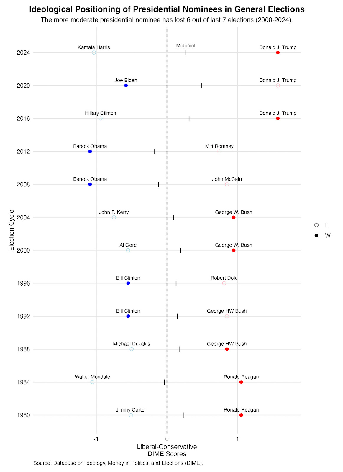
There’s been some talking past each other on twitter, specifically about this graph (below). This is the only thing I can see where the authors break out ideology points for individual candidates and make a point about “the more moderate candidate winning”. According to the label on the graph, this is using DIME scores and not their composite ideology metric. This has lead to confusion where the authors clarified they use composite, not DIME, in response to tweets about this specific graph which does seem to use DIME. It’s certainly weird that this graph seemingly uses a different metric than the bulk of their work, and I’d love to see it recreated with the composite measure.